Original Watercolor · Study
Curatorial Introduction
A Collection Built on Sunlight, Movement, and Humor
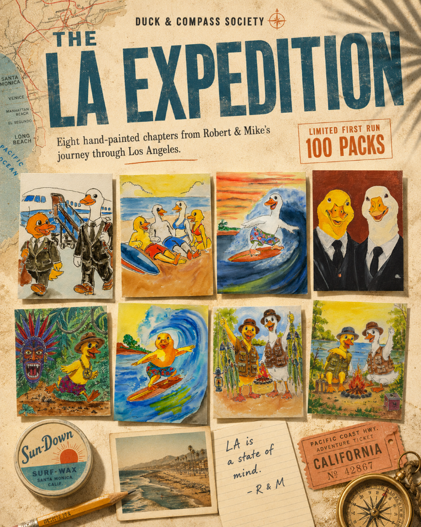
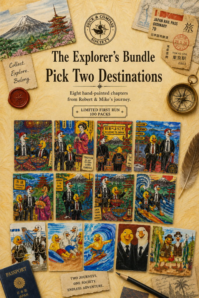
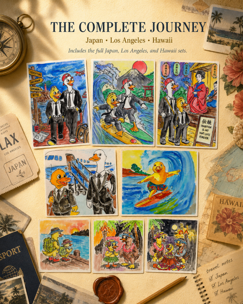
The Los Angeles Gallery presents the original watercolors behind the Los Angeles Expedition—a collection inspired by the experience of military families arriving in Southern California.
The paintings explore the contrast between formal arrival and informal discovery: suits and surfboards, taxi rides and beach days, official portraits and unexplained aerial phenomena.
The gallery traces the creative process from early composition studies through final packaging, making visible the decisions behind every card.
“Los Angeles is a city where the official and the absurd live on the same street.”
Original Artwork Exhibition
The Paintings
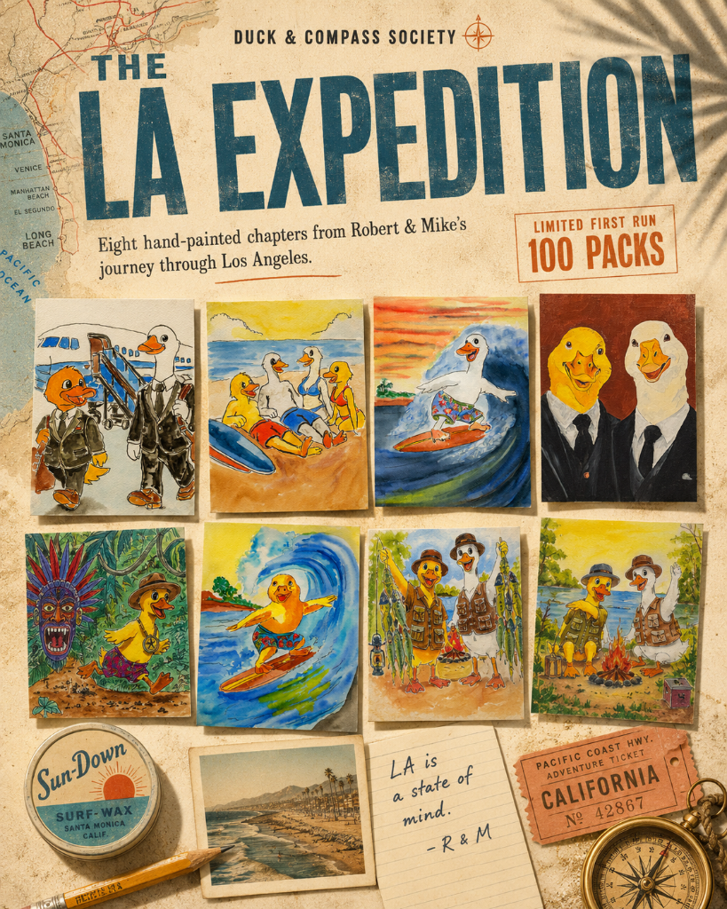
Plate 01
Airport Arrival
The first LA painting. Composition balances the scale of the airplane against the small figures of Robert and Mike.
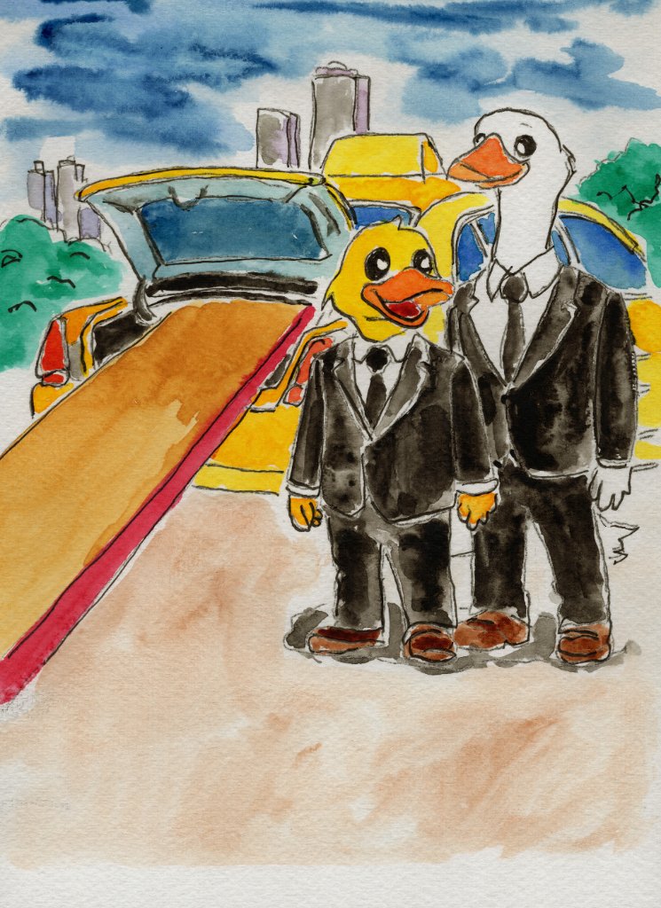
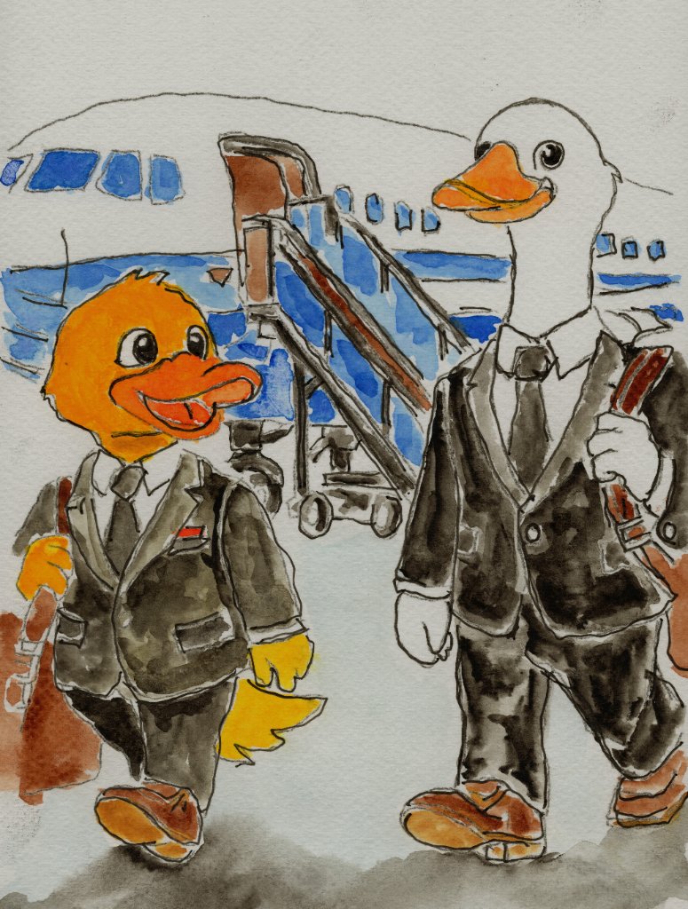
Plate 02
Taxi Ride
Bold California color palette. The surfboard in the trunk was a compositional decision that sets the tone for the entire collection.
Plate 03
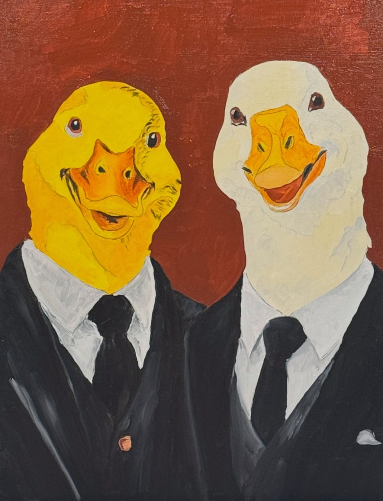
Official Portrait
A formal portrait painted against deep red. The contrast between formality and the journey ahead is the story of this piece.
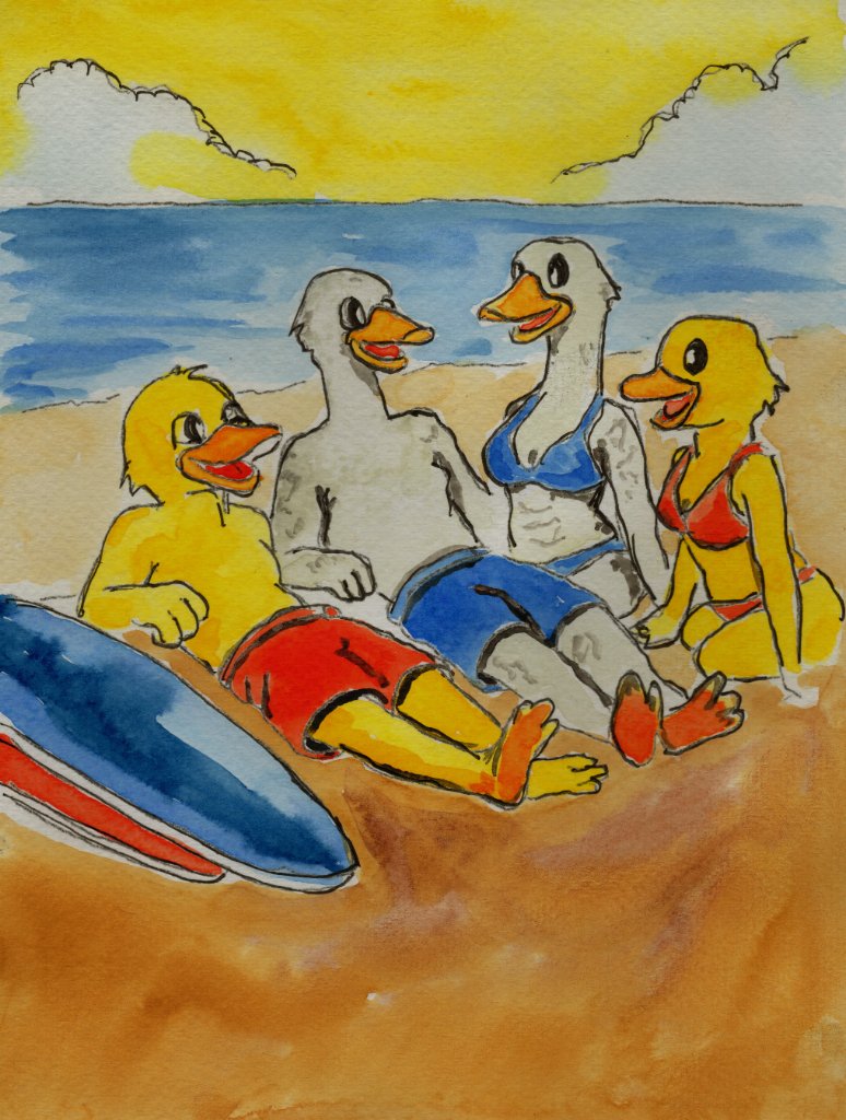
Plate 04
Beach Life
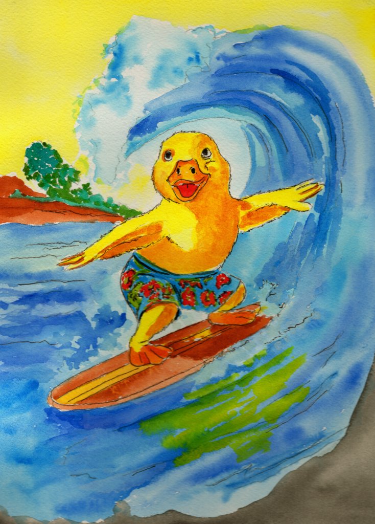
Loose, warm brushwork captures the feeling of Southern California shoreline. Color choices shift from urban to coastal palette.
Story Behind the Collection
From Airport to Ocean
The Los Angeles collection follows Robert and Mike through the experience of arriving in a city that feels larger, brighter, and faster than expected.
Each scene was chosen to capture a different face of Southern California: the airport, the taxi, the portrait, the beach, the surf, the mystery, the weekend beyond the city.
The narrative moves from structure and formality into freedom and discovery. The artwork was painted to carry that transition.
“The first day is the suit. The second day is the surfboard.”
Pencil construction lines visible beneath the paint
Sketches and Early Development
Finding Composition in a City of Distractions
Los Angeles presented a compositional challenge: how to capture a city that is simultaneously about movement, scale, light, and fantasy.
Thumbnail sketches explored how to balance the airplane against the figures in the arrival card, how to frame the taxi so the surfboard tells its own joke, how to use the formal portrait as a counterpoint to the chaos that follows.
The pencil lines beneath each finished painting reveal these early decisions about scale, placement, and narrative weight.
“In Los Angeles, every composition competes with the city itself.”
Watercolor and Ink Process
A California Palette
The Los Angeles collection required a palette that could shift from the warm golds of California sunlight to the deep blues of Pacific waves, from the formal red of a portrait background to the green of tropical foliage.
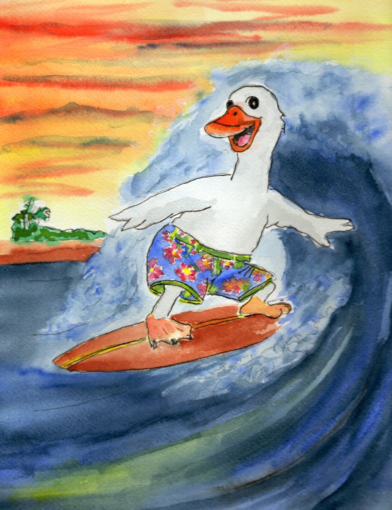
Each painting used layered watercolor washes to build the feeling of light and heat. The ocean scenes required wet-on-wet technique to capture movement and transparency.
The visible brushwork and pigment texture are integral to the collection’s feeling of hand-crafted warmth.
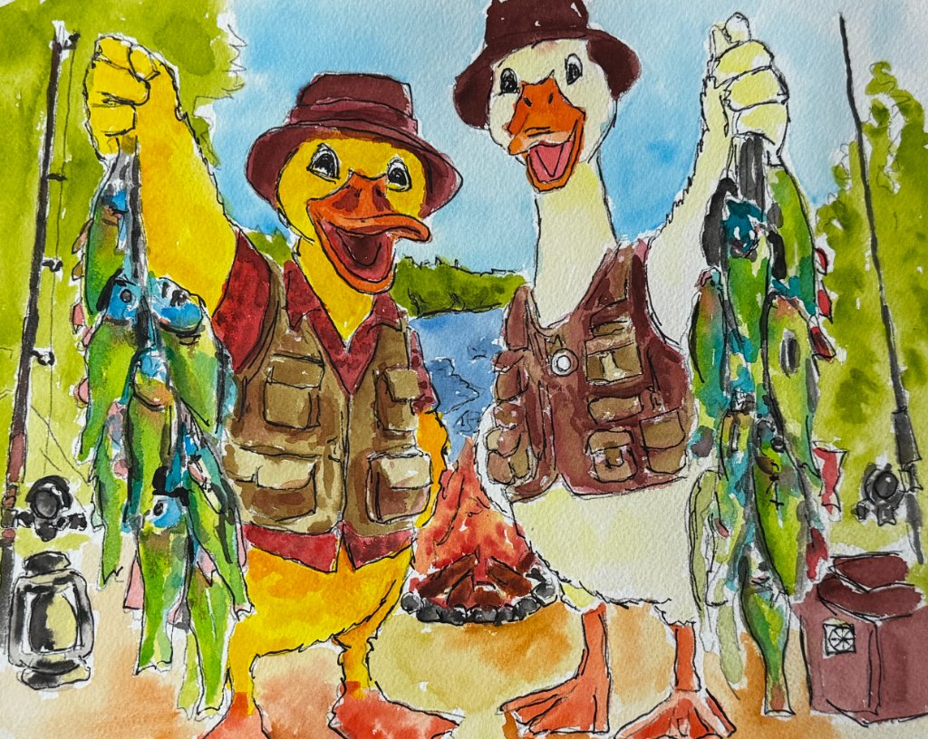
“California light is not painted. It is built, layer by layer.”
Character and Composition Decisions
Robert, Mike, and the City Around Them
The placement of Robert and Mike in the Los Angeles collection tells a story of contrast. In the arrival card, they are small beside the airplane. In the portrait, they fill the frame. In the beach scene, Robert relaxes while Mike is conspicuously absent.
These decisions were deliberate. Composition determines who the viewer notices first, what feels large, what feels small, and where the humor lives.
The surfboard in the taxi, the red background of the portrait, the scale of the wave—each was a compositional choice that shapes the story.
“Composition is the quiet director of every scene.”
Paper, Printing, and Color
Reproducing the California Light
After each painting was complete, it was scanned at high resolution to preserve the warmth and saturation of the original watercolors.
The reproductions are printed on premium card stock chosen for its ability to hold the golden tones and deep blues that define the Los Angeles palette.
Each print is checked against the original to ensure the reproduction carries the same emotional warmth as the painting.
“The print should feel like California light in your hand.”
Hand Finishing
From Print to Collectible
Each printed card is hand-finished in the studio. Edges are inspected, color is verified, and an embossed mark is pressed into the stock.
The embossment adds a tactile dimension that can be felt as well as seen—a small detail that distinguishes a collectible from a commodity.
Every card is individually held and checked before it enters a pack.
“The hand finishes what the printer begins.”
Packaging and Wax Sealing
Sealed and Sent
Each Los Angeles pack is assembled by hand. Cards are placed in protective sleeves with archival tissue. A handwritten label identifies the collection.
The pack is sealed with wax, creating a moment of ceremony when the collector breaks the seal and opens the journey.
The packaging is designed to feel personal, protective, and intentional.
“The seal says: someone was here before you.”
Artist’s Reflection
What the Los Angeles Collection Became
The Los Angeles Expedition began as an attempt to capture the feeling of arriving in a city that is simultaneously official, beautiful, absurd, and alive.
Through painting and composition, that feeling became a series of cards that move from formality to freedom, from the airport to the ocean.
The hope is that collectors will see not just illustrations of Los Angeles, but evidence of a person’s attempt to understand a city through art.
“Every painting is a way of paying attention to a place.”
Carry the Collection Home
Continue to the Expedition
Each gallery journey concludes with the same three pathways into the collectible collections.